Your average shipping cost per order looks fine. Maybe $8, maybe $9. It hasn't moved much in months, so the assumption holds: shipping is under control. But that $8 average is doing something dangerous. It's blending a $4 lightweight skincare shipment to New Jersey with a $17 oversized home goods bundle headed to rural Montana, and presenting both as the same cost.
What blended shipping metrics hide is a growing cross-subsidy where your most profitable SKUs absorb the fulfillment losses of your worst performers, and the subsidy scales invisibly as order volume grows. According to McKinsey (2022 analysis), fulfillment costs account for 12 to 20 percent of eCommerce revenues, and that percentage is climbing. When those costs are only tracked as a single blended line item, the variance between your cheapest and most expensive orders to fulfill stays buried.
This article breaks down how blended shipping averages create margin risk, what cost to serve includes, and how order-level visibility gives your ops and finance teams the data to stop guessing and start protecting margin.
Is your data actually Decision-Grade?
9 questions. 3 minutes. Score your Profitability Visibility and Readiness for AI-driven growth.
Start Free Diagnostic
The Danger of the "Blended Average"
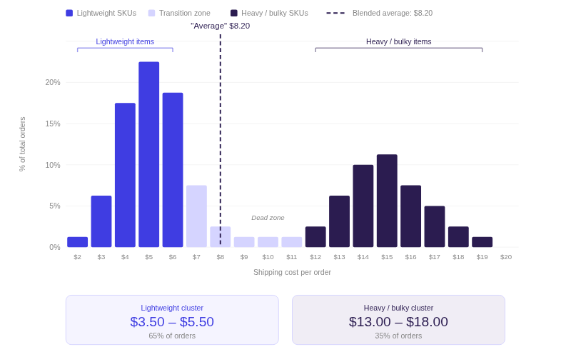
A blended average shipping cost gives every order in your catalog the same fulfillment number, regardless of what was shipped, how far it traveled, or how much space it consumed on the carrier's truck. That single number becomes the assumption plugged into contribution margin reports, free shipping threshold math, and SKU-level profitability models. The problem is that the average represents neither your cheapest nor your most expensive orders. It sits in the middle of a distribution that is often bimodal, and the gap between the two clusters is where margin leaks live.
The Cross-Subsidy You Cannot See
Consider a hypothetical DTC brand with 200 active SKUs. Their dashboard shows an $8.20 average shipping cost per order. When the operations team finally maps actual carrier invoices back to individual orders, the picture splits in two: lightweight items (cosmetics, accessories, small apparel) ship for $3.50 to $5.50. Heavy or bulky items (home goods, kits with inserts, multi-item bundles) ship for $13 to $18, depending on zone and DIM weight.
The $8.20 average mathematically exists, but no individual order costs $8.20 to ship. It's a fiction that allows the heavy-item losses to hide behind the lightweight-item gains.
This cross-subsidy is invisible as long as you report fulfillment at the aggregate level. And it compounds. Every time you run a promotion that increases the mix of heavy or bulky items, the subsidy grows, but the blended average barely moves because the lightweight orders dilute the signal.
Why Scaling on a Blended Metric Scales Your Losses
The second problem is growth. A brand scaling order volume by 30% while relying on blended shipping math will scale its hidden losses proportionally. If 15% of orders are margin-negative after true fulfillment costs, growing from 10,000 to 13,000 orders per month means roughly 450 more unprofitable shipments every month. The blended average stays at $8.20. The bank balance tells a different story.
This is the dynamic that catches operators off guard: top-line revenue and order volume grow, but cash doesn't follow at the expected rate. The gap between projected margin and actual margin widens quarter over quarter, and nobody can point to a single cause because the average hasn't changed. What blended shipping metrics hide, in this case, is a structural subsidy that gets worse the faster you scale.
Deconstructing "Cost to Serve" in ECommerce
Cost to serve is the total end-to-end expense required to fulfill a specific order for a specific customer. It goes well beyond the carrier label rate, and every component varies by SKU, destination, channel, and fulfillment method. Until you break it into its parts, you cannot attribute it accurately at the order level.
Beyond Postage: What Cost to Serve Actually Includes
Most brands mentally equate "shipping cost" with the price on the carrier label. The actual cost to serve an order includes:
One component most brands undercount is return logistics. When a customer returns an item, the return shipping cost, restocking labor, and repackaging expense rarely get attributed back to the originating order or SKU. Instead, returns are typically booked as a lump-sum expense line. For categories with high return rates (apparel, home goods), this means the true cost to serve those SKUs is higher than any forward-shipping analysis alone will show. If your return rate runs 20% or more on certain product lines, failing to attribute reverse logistics costs to specific SKUs understates their real cost to serve by a significant margin.
In 2026, UPS and FedEx both implemented base rate increases averaging 5.9%, but industry analysts at both PartnerShip and ShipperHQ estimate effective increases of 8 to 12 percent for eCommerce brands once surcharges are factored in. A residential delivery of an oversized package to a rural Zone 8 destination can now carry $80 to $120 in combined surcharges on top of the base rate, between residential fees, additional handling, fuel, and delivery area charges. None of these layered costs show up in a blended average.
The Dimensional Weight Trap
Carriers charge based on whichever is greater: actual weight or dimensional weight. DIM weight is calculated by multiplying length × width × height and dividing by a carrier-specific divisor (typically 139 for FedEx and UPS domestic). A lightweight but bulky item, like a throw pillow or a large gift box with foam inserts, can have a DIM weight three to four times its actual weight. The carrier bills accordingly.
A brand running a dimensional weight surcharge audit on its catalog might discover that 20% of its SKUs are DIM-billed at rates 40 to 60 percent higher than their actual-weight rate would suggest. When these SKUs are blended into the catalog average, the DIM penalty disappears into the aggregate. The product team sees a light item. The finance team sees a normal average. The carrier bills for the space.
Shipping Zones and Channel-Level Cost Variance
A carrier's zone chart maps the distance between origin and destination. Zone 2 (nearby) might cost $5.50 for a 2-lb package. Zone 8 (cross-country) might cost $14.50 for the same package. If your 3PL is on the East Coast and a marketing campaign drives a surge of West Coast orders, your zone-based shipping cost analysis shifts overnight, but your blended average won't register the change for weeks.
Channel adds another layer. DTC orders fulfilled from your 3PL carry pick, pack, and carrier costs. Amazon FBA orders carry Amazon's fulfillment fees, referral fees, and storage fees. Wholesale orders may carry freight charges and retailer chargebacks. Each channel has a different cost-to-serve profile, and when 3PL charges impacting contribution margin are lumped into the same average as Amazon FBA fees, you lose the ability to see which channel is generating margin and which is quietly burning it.
Why Spreadsheets Fail at Granular Shipping Analysis
Tracking cost to serve at the order level is theoretically possible in a spreadsheet. In practice, it breaks down because of two forces that compound each other: timing and scale.
The Timing Lag Problem
The cost to fulfill an order does not land in your data at the same time the order is placed. Here is the typical sequence:
- Day 0: Customer places the order on Shopify. Revenue is booked.
- Day 1–3: 3PL picks, packs, and ships. A tracking number is generated, but no cost data is attached yet.
- Day 5–10: Carrier delivers the package. Transit and delivery data become available.
- Day 25–35: 3PL sends the monthly invoice with actual pick, pack, and storage fees per order.
- Day 30–45: Carrier invoice arrives with linehaul charges, zone surcharges, and DIM weight adjustments.
- Day 45–60: Retroactive surcharges (fuel adjustments, peak season demand fees, address corrections) are applied.
At no single point in this timeline does all cost data for an order exist in one place. One Saras client's finance team described receiving a 33GB shipping data file for a single month, containing carrier-level surcharge detail that they couldn't even open in Excel. This is not an edge case. It's the structural reality of shipping cost reconciliation in eCommerce for any brand processing more than a few hundred orders a day.
Watch for this signal: If your average shipping cost hasn't changed in six or more months but your product mix has shifted toward larger or heavier items, you are almost certainly absorbing cost increases invisibly. The blended number masks the DIM weight and zone variance that your carrier invoices would reveal.
The Scale Problem
At 50 orders a day, a motivated analyst can VLOOKUP carrier tracking numbers back to Shopify order IDs, manually match 3PL invoice line items, and reconcile the result. At 500 orders a day, this is a full-time job. At 2,000 orders a day, it is physically impossible without automation.
The manual process also introduces fulfillment cost variance that compounds over time. Different analysts use different allocation rules. Surcharges that arrive after the monthly close get rolled into the next month or dropped entirely. Carrier credits and billing disputes create orphaned records. The spreadsheet becomes a living document with dozens of assumptions baked into its formulas, and nobody outside the person who built it can validate the numbers.
The result is that most finance teams default to one of two shortcuts: they apply a flat shipping percentage to all orders (say, 8% of revenue), or they use the 3PL's blended rate card as a proxy for actual costs. Both approaches work at the aggregate level. Both fall apart the moment you try to answer "what is the true cost to serve for this specific SKU shipped to this specific zone through this specific channel?" And that is exactly the question you need to answer to protect SKU-level profitability.
The Impact on Pricing and Free Shipping Thresholds
The downstream damage from blended shipping math shows up most clearly in two places: free shipping thresholds and promotion design. Both are set using averages, and both can turn margin-positive orders into margin-negative transactions when actual cost to serve is attributed.
When Free Shipping Thresholds Lose Money
Here is a hypothetical scenario:
A DTC home goods brand sets its free shipping threshold at $75, based on the blended average showing $8.50 per order in fulfillment cost.
A customer places a $78 order containing a heavy ceramic vase (actual weight: 6 lbs, DIM weight: 9 lbs due to protective packaging) shipped to Zone 7.
Actual cost to serve: pick fee ($2.80) + packaging ($1.90) + carrier linehaul with zone and DIM adjustment ($12.40) + residential surcharge ($6.50) + fuel surcharge ($1.80) = $25.40.
The order's CM2 goes negative, but the dashboard registers it as a converted sale above the free shipping threshold.
One brand that worked with Saras analyzed its fulfillment costs by order value tier and discovered that raising its free shipping threshold from $100 to $150, validated by A/B testing with minimal conversion rate impact, generated $1.5M in annualized savings. A second change, optimizing carrier selection by order weight and zone, delivered an additional 30% reduction in fulfillment costs. Neither decision would have been possible using blended shipping math.
Important: The cost-to-serve calculator eCommerce teams need isn't a single formula. It's a system that ingests actual carrier billing data, maps it back to the order and SKU, and segments the result by zone, channel, weight class, and service level. Until that system exists, every free shipping threshold is based on an assumption that may not hold for a meaningful share of your order mix.
Building Region and Channel Shipping Cost Profiles
The fix here is to know exactly where free shipping costs you money and where it doesn't. This requires building cost profiles by region and channel.
A region profile segments your actual carrier costs by destination zone. It answers: where are the zones where your cost to serve exceeds your margin on typical orders? A channel profile does the same by fulfillment method: DTC via 3PL, DTC via in-house warehouse, Amazon FBA, wholesale. When these profiles exist, you can make targeted decisions: tiered shipping thresholds by product weight, zone-specific carrier selection, or even SKU-level shipping surcharges for items whose fulfillment cost is structurally above the catalog average.
This is where what blended shipping metrics hide becomes an eCommerce contribution margin strategies problem. If fulfillment costs live inside your CM2 layer (net revenue minus COGS minus fulfillment, shipping, marketplace fees, and payment fees), then every dollar of unattributed shipping cost distorts the margin number your growth team uses to set CAC targets and your finance team uses to report profitability.
Achieving Decision-Grade Cost to Serve Data with Saras Pulse
Moving from blended averages to order-level cost to serve requires automating shipping cost reconciliation by SKU/channel. Saras Pulse connects 3PL billing, carrier invoice data, and warehouse cost feeds directly to your sales and order data, mapping actual pick, pack, shipping, and surcharge costs back to each Shopify order and SKU.
This means CM2 reporting reflects real fulfillment costs, not estimates. Region and zone cost profiles get built automatically. DIM weight penalties surface at the product level instead of hiding in a catalog average.
When one Saras client transitioned from FedEx to USPS before the holiday season, the order-level fulfillment dashboards revealed USPS pickup scanning lags were creating delivery delays. The data enabled a strategic decision to revert to FedEx for the holiday period and proactive CX outreach for affected orders. Within the first quarter, order-status customer queries dropped by nearly half, and the brand subsequently achieved a 30% reduction in fulfillment costs and a 20% reduction in late deliveries by using the same order-level data to optimize carrier selection by zone.
💡 Optimize Your Fulfillment: See how leading brands use Saras Pulse to identify margin-draining shipping configurations and implement data-driven tiering to recover massive cost savings.
👉 Talk to our Data Consultants ## Conclusion
Every blended shipping average contains a hidden transfer: profitable SKUs funding the fulfillment losses of unprofitable ones. The subsidy grows as order volume scales, and it stays invisible until you attribute actual carrier costs at the order level. Fixing this is not a spreadsheet project. It requires a data foundation that ingests 3PL invoices, carrier billing, and warehouse costs, then maps them back to each order and SKU automatically.
If your finance team is still closing the month with estimated shipping costs, talk to the Saras Analytics data consultants. Saras Pulse is the omnichannel data intelligence platform that maps your true cost to serve back to every order, SKU, zone, and channel so your CM2 reflects what happened, not what you assumed.

.png)
.svg)
%201%20(1).svg)


.png)


.png)


.png)


.png)


.png)


.png)


.webp)

.avif)


.avif)

.avif)
.avif)
.avif)
.avif)
%20(1).avif)
.avif)
%20(1).avif)
%20(1).avif)