Cohort retention analysis is one of those tools that separates brands that guess about retention from brands that actually know what’s happening with their customers. For many DTC brands, retention is the core revenue driver. According to research, returning customers generate ~60% of revenue, yet the average retention rate across DTC is only ~28%. Without cohorts, these critical dynamics stay hidden.
If you’re only looking at averages, say your monthly churn rate or a blended lifetime value, you’re looking at a blurry picture. That’s where cohorts change the game. Instead of lumping everyone together, you group customers by the month they joined, the campaign that brought them in, or even the first product they bought. Then you track what those groups do over time. Suddenly, you see which customers are worth the acquisition cost, how long it takes them to pay you back, and which ones never come back at all.
For repeat-purchase businesses (like supplements, coffee, beauty, or home essentials) this kind of visibility is crucial. If half of your customers vanish after their first order, you’ll never hit your growth targets, no matter how much you spend on acquisition.
This article will break down how to use customer retention cohort analysis to improve retention rates, grow margins, and make better investment decisions. Along the way, we’ll dig into the key metrics, real-world examples, and some industry benchmarks you can use to gauge your own performance.
What is Cohort Retention Analysis?
Cohort retention analysis is about grouping customers into sets and following their journey over time. The grouping or “cohort” can be based on when they first purchased, where they came from, or what product they bought first.
Once grouped, you track how those customers behave.
- How many came back in month two?
- How many were still active after six months?
- How much revenue did that single cohort generate over a year?
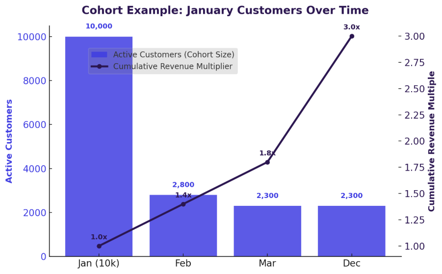
Here’s a simple example. Imagine a health and wellness brand that brings in 10,000 new customers in January. In February, 2,800 of them come back. By March, maybe 2,300 are still active. By December, that same group might have generated three times the revenue they spent in their first purchase month.
Now compare that with a March cohort from the same brand. Maybe fewer customers came back after their second purchase. Maybe they generated less revenue over time. That difference (January versus March) isn’t visible in a single average retention number. You only see it when you line up the cohorts side by side.
Here’s the overlayed retention curve comparing January vs. March cohorts:
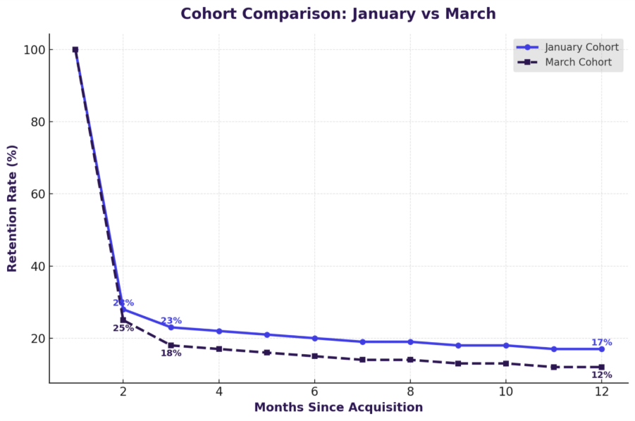
- Blue line (Jan cohort) → higher retention, stabilizes after Month 3.
- Purple line (Mar cohort) → faster drop-off, ending lower by Month 12.
- Annotations at Month 2, 3, and 12 make the contrast explicit.
Why Use Cohorts to Measure Customer Retention?
If you’re serious about customer retention, you need more than a topline churn percentage. Cohorts add depth. They reveal when customers leave, why some stay longer, and how different acquisition strategies play out over time.
Averages Hide Variability
Let’s say your brand has a 55% repeat purchase rate. On paper, that looks solid. But dig deeper and you may find that 45% of customers never come back at all. Retention cohort analysis makes this split visible. You see, month by month, exactly how many customers return and how many you’ve lost for good.
Time-Based Behavior Tracking
Churn usually spikes at specific moments. A coffee subscription might see big drop-offs after the third delivery. A skincare brand might notice customers vanish after the second order. Customer retention cohort analysis puts those turning points on a timeline, so lifecycle marketers know exactly when to step in with a loyalty offer or a subscription flexibility option.
Comparability Across Groups
Not all acquisition sources are equal. Customers acquired through Google search might quietly turn into your most loyal segment, while those acquired through heavy discounting on social ads could churn after the first order. Cohort analysis retention dashboards make these comparisons easy. With that clarity, marketers can redirect budget toward channels that bring in high-value buyers and away from the ones that don’t.
Granularity by Segment
Yes, first products do matter. A beauty brand might see that customers who start with a subscription kit have twice the lifetime value of customers who just buy a single cleanser. That's how product and CX teams can leverage cohort analysis customer retention to isolate those differences and design acquisition strategies around the products that naturally drive loyalty.
Foundation for Strategic Decisions
At the leadership level, cohort retention analysis links marketing spend to business health. Finance teams can see how quickly customers pay back acquisition costs. Marketing teams can measure whether campaigns are improving retention curves. CX teams can test onboarding improvements and immediately see the effect on repeat purchases. Instead of relying on static averages, cohorts provide the kind of forward-looking insight that informs cash flow planning, budgeting, and retention strategy.
Benefits of Using Cohort Retention Analysis:
Cohort analysis isn’t just about tracking churn more precisely. When used well, it becomes a decision-making framework that cuts across marketing, finance, and customer experience. Below is a table that encapsulates the benefits of using cohorts retention analysis:
Different Types of Cohort Retention Analysis
Cohort analysis isn’t one-size-fits-all. Different ways of grouping customers reveal different dimensions of retention. By layering these approaches, brands build a more complete picture of loyalty and profitability.
Here are the most common cohort types:
Key Metrics to Track in Cohort Retention Analysis
Metrics turn retention into something measurable and actionable. Here are the must-track metrics that every DTC brand should monitor:
Retention Rate (Day-1, Day-7, Day-30, etc.)
Retention rates show how many customers remain active after a given time interval. For a subscription service, day-30 retention is often the most predictive of long-term value. Retention rate cohort analysis makes it possible to see not just the current rate, but how it shifts over months and years.
Churn Rate
Churn is simply the flip side of retention. Cohort dashboards highlight the exact moment when customers drop off. With that knowledge, lifecycle teams can build interventions around those inflection points.
Repeat Purchase Rate
This metric highlights how many customers make more than one purchase in a given time frame. If 30% of customers buy again within two months, that’s a sign of strong product-market fit. If it drops to 10%, it’s a red flag that the onboarding or product value isn’t resonating.
Average Revenue Per User (ARPU)
ARPU shows how much revenue each customer in a cohort contributes on average. It’s a simple calculation: total revenue divided by total customers in the group.
A subscription box company may start with $85 ARPU in the acquisition month. By month twelve, the same cohort could average $270; thanks to repeat purchases. Seeing that curve climb tells finance teams whether their customers are compounding in value or plateauing too early.
Customer Lifetime Value (CLV)
No doubt, CLV is the north star for profitability. It measures the net profit generated by a customer over their relationship with your brand.
Suppose you spend $100 to acquire a customer. Over a year, they generate $150 in profit. So, your LTV:CAC ratio is 1.5:1. That’s below the benchmark many investors and analysts expect. Statistics say, a healthy LTV:CAC is 3:1 or higher. Cohort analysis customer retention dashboards let you track this ratio over time, not just as a single static number.
Suggested Read: Ecommerce Customer Value
Gross Margin by Cohort
Revenue isn’t enough; margin is what counts. By measuring gross margin at the cohort level, you can see if certain campaigns or customer groups are actually generating profits. For example, a discount-heavy campaign might drive high revenue in the first month. But once costs are factored in, the margin is razor thin.
Customer Acquisition Cost (CAC) and LTV:CAC Ratio
CAC tells you how much it costs to bring in a new customer. The LTV:CAC ratio shows whether those dollars pay off. Retention cohort analysis makes this crystal clear, and when tracked across cohorts, it shows whether your acquisition efficiency is improving or declining.
Payback Period
Payback is about timing: how long does it take to recover acquisition costs? One cohort may pay back in five months. Another may take a full year.
That difference shapes cash flow strategy. If payback is short, you can reinvest quickly. If it’s long, you need to slow your acquisition pace. Customer retention cohort analysis ensures this timeline isn’t hidden.
Suggested Read: CAC Payback Period
Subscription Take Rate
Subscription-first customers almost always deliver higher lifetime value than one-time buyers. Tracking the percentage of customers who join via subscription helps you evaluate the health of your acquisition funnel.
For instance, a coffee brand might find that 45% of new customers start with a subscription. Those customers end up generating twice the CLV of single-purchase customers. That’s a signal to redesign the purchase journey to nudge more customers toward subscriptions.
How Faherty Leveraged Cohort Retention Analytics
Faherty, a $220M omnichannel apparel brand with 70+ retail stores, was growing quickly but faced a strategic blind spot: which customers actually drove sustainable revenue. Like many premium retailers, they had relied on broad RFM segmentation and averages, which masked the differences between loyal repeat buyers and one-time shoppers. As customer acquisition costs rose and competition intensified, leadership needed sharper answers.
By partnering with Saras Analytics, Faherty moved from high-level metrics to cohort-driven insights. Instead of lumping all customers together, they began tracking segments by acquisition date, product mix, and value tier over time. This allowed them to see not just how much revenue came in, but which cohorts paid back acquisition cost quickly, which ones churned, and which were worth re-engaging.
The Problem with Old Segmentation
Faherty’s earlier segmentation had three key flaws:
- Unmapped customers (~10% of the base).
- Biased recency (sale-driven spikes were misclassified as loyalty).
- Static cutoffs that weren’t data-driven (e.g., $600 CLV = “champion,” even if inflated by bulk purchases).
This meant marketing was often over-investing in the wrong groups while under-leveraging high-potential but at-risk segments.
Building Cohorts that Mattered
Saras Analytics rebuilt Faherty’s Customer 360 using micro-segmentation and cohort tracking, creating dynamic groups such as:
- Hall of Fame / All-Stars: high CLV customers with consistent multi-year activity.
- Starters & One-and-Dones: newer buyers with low spend, prone to churn.
- Snoozing / Lapsing / Zombies: past buyers showing warning signs.
Crucially, cohorts were layered with recency flags (“alive and well,” “snoozing,” “lapsing”) and risk indicators (risk of snoozing, lapsing, or going dormant). This transformed Faherty’s retention view from a static report into a forward-looking map of risk and opportunity.
Cohort-Driven Campaigns
Armed with this intelligence, Faherty redesigned its direct mail strategy. Instead of blasting generic catalogs, campaigns were tailored by cohort:
- Guidebook campaigns targeted Hall of Fame and All-Stars, reinforcing loyalty among proven high-value customers.
- Catalog campaigns prioritized activating Starters and One-and-Dones, nudging them into repeat purchase behavior.
- Snoozing and lapsing customers with higher AOVs were selectively re-engaged, improving efficiency.
This incrementality testing allowed Faherty to prove which formats worked for which cohorts, tying spend directly to results.
The impact:
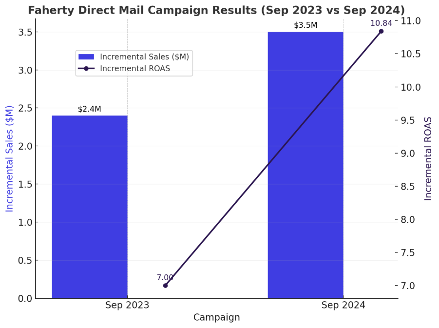
- $1.1M uplift in incremental sales in September 2024 (+46% YoY), even while cutting circulation by 5%.
- Incremental ROAS improved 55% (from 7.0 in 2023 to 10.84 in 2024).
- Higher incremental revenue per customer, driven by successfully activating Starter and One-and-Done cohorts.
- Clear evidence that catalogs re-engaged lower-value groups while guidebooks reinforced loyalty among top spenders.
Why Cohort Analytics Mattered
For Faherty, the shift to cohort retention analysis wasn’t just about sharper segmentation. It fundamentally changed how leadership connected acquisition spend, retention, and profitability. Instead of chasing topline growth with broad averages, cohorts showed exactly:
- Which customers were paying back CAC fastest.
- Where churn risk was emerging.
- How to balance nurturing high-value buyers with reactivating at-risk segments.
This clarity allowed Faherty to forecast sales with 92% accuracy, optimize fulfillment, and drive sustainable growth, turning data into a true competitive advantage.
.avif)
11 Ways to Use Cohort Analysis to Improve Retention Rates
This table breaks down eleven actionable ways to apply cohort retention analysis, showing common retention problems and how cohort insights can be used to solve them effectively.
How to Perform Cohort Retention Analysis: Step by Step
With the right process, any ecommerce team can run cohort analysis. With the right tools, it becomes part of your weekly workflow.
Step 1: Define the Cohort Criteria
Start by deciding how you want to group customers. Common options include:
- By time: month or quarter of acquisition.
- By channel: search, social, affiliates, email.
- By product: first SKU purchased.
- By order type: subscription-first vs. one-time buyers.
For most DTC brands, acquisition month is the baseline. It links directly to marketing spend and gives a clean view of performance over time.
Step 2: Collect Data
Next, gather the right inputs. At minimum, you need:
- Transaction history (orders, values, dates).
- Marketing spend by channel or campaign.
- Subscription status and renewal data.
- Engagement signals (opens, clicks, app usage if applicable).
The more complete the data, the more accurate your retention metrics will be. Gaps here lead to misleading CAC or CLV numbers.
Step 3: Segment Customers into Cohorts
Once you have the data, group customers based on your chosen criteria. For example, a January 2024 cohort could include only customers whose first order happened in that month. Keep the rules strict to avoid overlap as clean cohorts are the foundation of reliable analysis.
Step 4: Visualize Retention
Finally, put the cohorts into a dashboard. Each row represents a cohort, each column a time interval: month one, month two, month three. You’ll instantly see which groups of customers stick around and which fall off early.
Step 5: Analyze Patterns
Look at the retention curves and spot where drop-offs occur.
- Do customers leave after the second order?
- Does churn spike after the third subscription cycle?
- Are certain channels consistently producing low-value cohorts?
Cohort analysis for retention is most powerful when you look beyond the numbers to understand the “why” behind them.
Step 6: Apply Insights
The next step is turning those observations into action. A few examples:
- If churn spikes after the second purchase, introduce loyalty perks or bundles to encourage a third.
- If subscription cohorts show higher CLV, highlight subscription options more prominently at checkout.
- If paid social brings in high-CAC but low-LTV cohorts, shift spend toward organic or referral channels.
Retention cohort analysis gives you evidence to make these calls with confidence.
Step 7: Track Over Time
Retention isn’t fixed; it shifts as campaigns, products, and customer expectations change. Track your cohorts regularly (monthly at minimum) to see whether changes are improving outcomes. Over time, you’ll build a clear record of what works, what doesn’t, and how your retention rates stack up to industry benchmarks.
5 Best Tools to Perform Cohort Retention Analysis
There are several tools on the market for building cohort dashboards, but not all are created equal. Some are better suited for lightweight reporting, while others are built for deep retention analysis. The best cohort analysis retention dashboards give leadership a simple but powerful lens: are the customers we’re bringing in actually sticking around long enough to make money?
Here’s a comparison of five popular options:
Saras Pulse is built specifically for ecommerce and DTC leaders who need retention insights tied to real financial outcomes. Features like subscription take rate, CAC-to-LTV tracking, and payback period analysis go far deeper than what’s available in general analytics tools.
Best Practices for Performing Cohort Retention Analysis
Cohort analysis only drives results if it’s done consistently and with the right focus. Here are best practices that top-performing brands follow:
✅ Do’s
- Be clear about your cohorts: Stick to simple rules like “customers acquired in January” or “first-time buyers from Facebook.” If you blur the lines, the data gets messy.
- Look at trends the same way every time: Whether it’s heatmaps or retention curves, consistency makes it easier to spot what’s actually changing.
- Tie the numbers back to the business: Metrics like CLV, CAC, and payback only matter if they connect to profitability and cash flow.
- Double down on what works: When you find a channel, product, or offer that consistently produces loyal cohorts, put more fuel behind it.
- Step in where customers drop off: If churn spikes after the second order, design interventions right there, not six months later.
- Track progress against yourself: Compare new cohorts to older ones to see if strategies are moving the needle, not just hitting arbitrary benchmarks.
- Make it a leadership habit: Pull up cohort dashboards in monthly reviews, not just marketing meetings.
❌ Don’ts
- Don’t trust averages as they hide the real story and make weak cohorts look better than they are.
- Don’t treat cohort analysis as a one-time exercise. Retention shifts constantly, and so should your view of it.
- Don’t celebrate revenue spikes without checking margin or payback. Growth that doesn’t stick is expensive noise.
- Don’t assume all customers are equal. A subscription starter and a discount-driven buyer behave very differently over time.
- Don’t ignore the “quiet quitters.” One-and-done buyers and lapsing cohorts often respond well to the right reactivation effort.
Transform Cohort Retention Analysis into sustainable growth with Saras Analytics
Cohort analysis customer retention isn’t just a reporting exercise. It’s the lens that connects marketing spend to customer loyalty and loyalty to long-term profitability. For ecommerce and DTC leaders, that connection is the difference between chasing revenue spikes and building a sustainable growth engine.
With Saras Pulse, you don’t need to stitch data together manually or rely on averages that hide the truth. What you get is sharper financial planning, smarter marketing, and stronger customer experiences. Cohort retention analysis shows you the story of your customers. Saras Pulse gives you the power to act on it. Talk to our Data Consultant Now.

.png)
.svg)
%201%20(1).svg)


.png)


.png)


.png)


.png)


.png)
.png)


.webp)
.avif)


.avif)

.avif)
.avif)
.avif)
.avif)
%20(1).avif)
.avif)
%20(1).avif)
%20(1).avif)