
According to a study, just 34 percent of marketers track ROI on a consistent basis. So, what is holding them back?
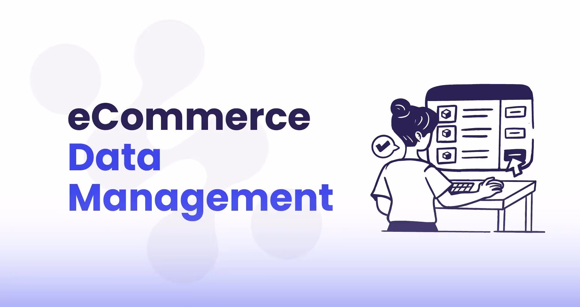
Every eCommerce or DTC brand ends up swimming in reports. Be it Meta campaigns, Google Ads, TikTok pushes, or email flows, each one comes with its own dashboards and CSV exports. The trouble is that all that data rarely fits together. Teams jump between tabs, paste numbers into spreadsheets, and still don’t feel like they have the full picture. A marketing analytics dashboard is what helps tie everything together. Instead of scattering insights across five different tools, it pulls the key metrics into one view. That single perspective makes it easier to shift budgets, plan strategy, and grow without second-guessing every move.
This guide will walk through what marketing analytics dashboards are, why they’re so important for growth-focused brands, and how to tell the difference between a useful dashboard and one that just looks nice on a slide.
Is your data actually Decision-Grade?
9 questions. 3 minutes. Score your Profitability Visibility and Readiness for AI-driven growth.
Start Free Diagnostic
What is a Marketing Analytics Dashboard
Think of a marketing analytics dashboard as the control panel for your growth engine. Instead of logging into Facebook Ads, then Google Analytics, then Klaviyo, and trying to stitch the numbers together, you get one place where it all comes together. The value isn’t just in the charts, it’s in the answers you get back:
- Which campaigns are delivering the strongest return on ad spend?
- How much of revenue is coming from new customers compared to repeat ones?
- Are budgets spread efficiently across paid channels?
- Which segments are driving the most lifetime value?
Why Marketing Analytics Dashboards Matter
According to a study, nearly 70% of marketing leaders say measuring campaign ROI is difficult, and two-thirds can’t clearly show the impact of those campaigns to stakeholders. That kind of uncertainty slows down budget approvals and makes optimization decisions lag.
In eCommerce, marketing spend is usually the second biggest cost after inventory. That spend gets scattered across search ads, paid social, email, influencers, and SEO. Without a clear view of what’s working, brands risk overspending in the wrong places. A well-structured dashboard helps avoid that by:
- Tracking ROI daily. Teams don’t have to wait for a weekly roundup to know what’s happening. If a campaign dips, they can adjust quickly.
- Linking campaigns to revenue. Integrations with Shopify or Amazon make it clear how ads are translating into sales, average order value, and margins.
- Cutting out manual work. Analysts aren’t wasting hours pulling exports; rather, they can spend time interpreting trends.
- Keeping everyone aligned. CMOs, growth marketers, and finance all reference the same live metrics.
The catch with most dashboards is the setup. They require engineering help, custom queries, and constant maintenance. By the time they’re ready, the data can already be out of date. Saras Pulse avoids that headache. It’s built specifically for eCommerce brands, with pre-made dashboards across sales, marketing, product, and customer data. Plug in your accounts, and instead of wrestling with integrations, you’re immediately looking at a unified view of your business.
Related Read: Ecommerce Analytics Dashboard
What Makes a Good Marketing Analytics Dashboard
Dashboards aren’t all created equal. Some look nice on the surface; like flashy charts or a handful of surface-level metrics. But they don’t actually help teams make better decisions. A lot of brands start with Google Data Studio, GA4, or whatever comes bundled with platforms like Meta or Klaviyo. Those tools are fine if you’re only looking at one channel at a time, but when you’re trying to understand how everything fits together, they fall short. Scaling brands need something more connected, something that feels like a control room rather than a pile of spreadsheets with a facelift.
Here are five qualities that really separate the dashboards that get used every day from the ones that sit open in a tab and gather dust:
1. Unified Cross-Channel Performance
The biggest headache for growth teams is fragmentation. Sales data lives in Shopify, ad spend in Meta, email results in Klaviyo, organic numbers in GA4; and none of those tools talk to each other by default. A strong dashboard pulls all of it into one place and translates it into business terms: revenue, margin, lifetime value. That’s when you stop chasing siloed metrics and start making decisions with context.
Instead of wondering “Did the spike in orders come from ads, or was it organic?” a unified marketing analytics dashboard shows the full chain: where the customer came from, what it cost to get them, and how much profit their order added.

2. Custom KPIs and Business Logic
Not every brand measures success the same way. A beauty brand spending heavily on influencers might track acquisition cost against lifetime value, while a subscription supplement brand obsesses over churn. The best dashboards give you the flexibility to set up your own formulas instead of locking you into generic metrics.
For instance, relying only on standard ROAS can mislead you if your best-selling products have razor-thin margins. Building a Gross Margin ROAS metric (profit after cost of goods divided by ad spend) instantly tells you whether campaigns are actually worth scaling. This kind of customization is what makes dashboards useful instead of ornamental.
3. Granular Segmentation and Filtering
Leaders need the 30,000-foot view. Marketers need the weeds. A solid dashboard caters to both. That means being able to flip between big-picture summaries and detailed drill-downs — product-level views, campaign splits, geo breakdowns, or customer cohorts.
Take a CMO looking at channel-level revenue: that high-level trend tells them if the mix is balanced. But the performance marketer might drill into a single ad set targeting lookalike audiences to figure out if CAC is creeping up. Both perspectives matter, and both should come from the same dashboard without creating separate reports.

4. Real-Time Visibility
In eCommerce, yesterday’s data isn’t good enough. If reports only refresh weekly, teams end up catching problems days too late, which can lead to wasted budget, burned audiences, and missed opportunities. Dashboards that update daily (or even multiple times a day) let teams spot inefficiencies quickly and shift spend before things get out of hand.
During high-volume periods (think Black Friday or a product drop) this speed is the difference between protecting margins and watching them disappear. It’s no surprise that research shows brands optimizing daily see 20–30% better ROAS compared to those who rely on weekly check-ins.
5. Role-Based Views
Executives don’t need to see CPC fluctuations for individual campaigns. Analysts don’t need a pie chart of total revenue. When everyone looks at the same raw dashboard, information overload kicks in. Good dashboards solve this with role-based views: executives get profitability and growth curves, marketers get channel and campaign details, and analysts can dig down to the finest granularity.
This way, nobody tunes out. Everyone gets the level of detail they need to act, and conversations move faster because everyone’s looking at the right cut of the data.
A dashboard that checks these boxes becomes more than a reporting tool. It turns into a decision-making system. Without them, dashboards end up as pretty charts on a screen that don’t change how the business runs.
Must-Have Metrics and KPIs in a Marketing Analytics Dashboard
A dashboard is only as good as the numbers it tracks. Load it up with 50 metrics, and people tune out. Keep it too thin, and you miss the signals that matter. The sweet spot is focusing on a set of must-have KPIs that map directly to how your brand makes and keeps money. For eCommerce and DTC teams, that means covering acquisition, conversion, retention, and efficiency.
Acquisition Metrics
Customer acquisition is usually where the money goes first. Dashboards should make it painfully clear how much it costs to bring someone in, and whether that spend is sustainable. At minimum, you’ll want:
- CAC (Customer Acquisition Cost): how much you spend per new customer.
- Traffic by channel: who’s coming in through search, paid social, organic, email, and so on.
- CTR (Click-Through Rate): how well your creative or targeting is getting attention.
Here’s why it matters: if CAC is rising while CTR is flat, you’ve probably maxed out your audience or need fresher creative. Without that view, you’re flying blind.
Related Read: CAC Payback Period
Conversion Metrics
Getting people to the site isn’t enough. You need to know what they do once they land. Key conversion KPIs include:
- Revenue by channel: tying spend directly to sales.
- Conversion rate (CR): orders divided by visits, broken down by traffic source.
- AOV (Average Order Value): how much the average customer spends per order.
Why care? Because the combination of CR and AOV tells you how much revenue you can expect from each 1,000 visitors. That math drives your media planning.
Related Read: Ecommerce Conversion Optimization
Retention and Customer Value Metrics
This is where profitability hides. Acquiring new customers is expensive, but the long-term value comes from getting them to buy again. The essentials here are:
- LTV (Lifetime Value): total revenue you expect from a customer over their relationship with you.
- Repeat purchase rate: what percentage of customers come back for another order.
- Churn rate: how quickly customers stop buying.
If your LTV is three times your CAC, you’re in a healthy spot. If repeat purchase rates are low, it’s a retention problem, not an acquisition one. Dashboards that make this obvious let you fix the right leak.
Efficiency and Profitability Metrics
This is the layer that keeps you honest. It’s not enough to drive sales; you also need to know if those sales make money. In this case, the important metrics include:
- ROAS (Return on Ad Spend): revenue divided by ad spend.
- Gross Margin ROAS: profit after COGS divided by ad spend — far more accurate than the standard version.
- CPO (Cost Per Order): spend divided by number of orders.
Industry benchmarks suggest a blended ROAS of around 3.0 is solid for U.S. DTC brands. But gross margin ROAS is where the truth lives; it keeps you from celebrating growth that’s secretly unprofitable.
Engagement Metrics
Finally, you want signals on how customers are interacting with your brand outside of checkout:
- Email open and click rates: to judge how well retention campaigns are performing.
- Social engagement rates: to measure the impact of organic content and influencer partnerships.
- On-site behavior: like time spent on site or product views, which hint at intent before the purchase.
Engagement metrics are often early warnings. If open rates dip, repeat purchase rates usually follow. If organic engagement spikes, it’s a sign to double down on that content style.
A marketing KPI dashboard that blends these five categories creates balance. Tools like Saras Pulse help here by skipping the messy setup. Instead of building every KPI from scratch, you get pre-built dashboards with acquisition, conversion, retention, and profitability metrics already wired in — across Shopify, Meta, Google Ads, and Amazon. It’s a shortcut to clarity.
11 Marketing Analytics Dashboard Examples
Every eCommerce brand has different growth priorities. Some need to monitor paid media efficiency, while others focus on retention, or SKU-level performance. The following 11 marketing analytics dashboards represent the most useful categories in 2026. They combine channel-specific insights with business-level clarity, helping leadership, marketers, and analysts make faster, more confident decisions.
1. Sales Performance Dashboard
Shopify will give you a clean revenue number, but it won’t tell you much else. Was that revenue driven by ads or organic? Was it mostly new customers, or your existing base coming back to restock? Did those sales actually leave you with profit, or just top-line vanity?
That’s where Saras Pulse’s Sales Performance Dashboard comes in. It lays out your key KPIs right at the top — sales, customers, orders, AOV, profit margin. But then it immediately breaks those down in ways that actually matter for decision-making. You can see how much of your sales came from ads versus organic traffic, how many were from brand-new customers compared to repeat ones, and even split things like B2C vs. wholesale.
This is especially useful in fast-moving DTC environments. Imagine a supplement brand running a summer flash sale. On the surface, sales spike looks exciting. But with this dashboard, you’d notice that 80% of the lift came from paid ads targeting first-time customers. That’s not necessarily bad, but if those customers don’t stick around, you may have traded margin for short-term vanity growth. Without a dashboard like this, leadership might greenlight more spend on the wrong campaigns.
The other big piece is cohort analysis. You can literally track how each “wave” of new customers behaves over their first 90 days. Are they placing second or third orders? Are they falling off after the first purchase?
For a DTC apparel brand, this can be eye-opening; maybe Instagram-acquired customers churn quickly, while TikTok-acquired ones stick around longer. That kind of detail is what helps teams refine acquisition strategy without burning cash.
.avif)
2. Google Ads Dashboard
Search advertising thrives on intent, making Google Ads a critical channel for many eCommerce brands. A dedicated Google Ads dashboard centralizes performance across search, shopping, and display campaigns, capturing metrics such as cost per click (CPC), conversion rate, cost per acquisition (CPA), and return on ad spend (ROAS).
The value of this dashboard lies in its granularity. Marketers can compare branded vs. non-branded keywords, evaluate Shopping feeds against text ads, or filter performance by geography. When integrated with eCommerce platforms, the dashboard ties campaigns directly to sales and gross margin contribution.
The main benefit is budget efficiency. By surfacing which queries or ad groups drive profitable growth and which drain spend, teams can reallocate dollars quickly. For CMOs, this dashboard provides confidence that search budgets are supporting growth without hidden inefficiencies.
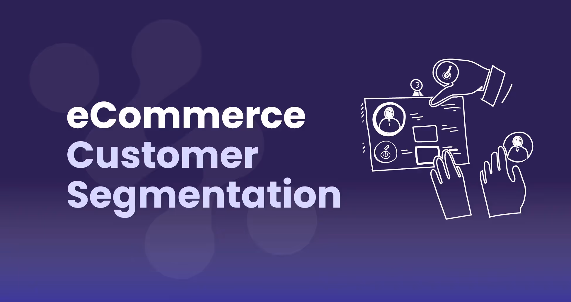
3. Customer Segmentation Dashboard
Every retention marketer talks about “knowing their customers,” but in practice, that usually means looking at an email list and guessing. Saras Pulse’s Customer Segmentation Dashboard makes that guesswork unnecessary by automatically dividing your customers into meaningful buckets based on recency, frequency, and spend.
What makes this dashboard stand out is the clarity of its visuals. You’ll see a pie chart or distribution that shows exactly how much of your base falls into each segment: Champions, Loyal, Promising, At Risk, Need Attention, Lost, and so on. You don’t just know the groups exist; you know how big each one is relative to your overall customer file. If 20% of your base is “At Risk,” that’s not something you want to ignore.
And the dashboard doesn’t stop at labeling — it gives you guidance. Champions? Perfect for referral pushes or VIP perks. Loyal customers? Prime them with bundles or early access drops. At Risk? They need targeted win-back flows before they slide into Lost. Seeing this mapped visually helps you prioritize campaigns without debate.
Then you’ve got the cohort table sitting underneath. It shows how customers acquired in a given month behave in the months that follow; whether they come back, how fast they churn, and whether trends are getting better or worse. A DTC coffee subscription company might see that February cohorts churn faster than January’s, which could indicate that their welcome flow or starter offer wasn’t strong enough in that month.
.avif)
4. SEO Performance Dashboard
Organic search remains one of the most scalable growth channels, but it requires constant monitoring. An SEO dashboard integrates data from Google Search Console, GA4, and keyword tools to track impressions, clicks, rankings, and organic traffic contribution.
The functionality goes beyond keyword tracking. It surfaces which landing pages attract the most traffic, how organic visitors convert compared to paid, and where content gaps exist. By tying SEO metrics into eCommerce sales, the dashboard connects content investments with revenue outcomes.
This dashboard is valuable because SEO can otherwise feel intangible. Instead of tracking rankings in isolation, brands see how search contributes to customer acquisition and whether content strategies are profitable. It also helps identify opportunities to defend branded queries, capture new non-branded keywords, or expand into international markets.
5. Facebook Ads Dashboard
Paid social remains a cornerstone of customer acquisition, but platform-native tools can overwhelm marketers with fragmented data. Saras Pulse’s Facebook Ads Dashboard simplifies this by consolidating spend, sales, ROAS, CPC, impressions, clicks, and cost per order into a single view.
The functionality includes campaign-level insights, showing which audiences and creatives deliver the highest returns. Trend charts highlight how efficiency metrics like CPC and ROAS evolve over time, making it easier to identify ad fatigue or opportunities to scale. The dashboard also highlights top-performing campaigns, giving managers a quick path to replicate success.
The benefit is speed of optimization. Instead of exporting spreadsheets or relying on weekly reports, marketers can see real-time campaign health and shift budgets immediately. Agencies also benefit from having a standardized template for client reporting, reducing manual work and improving transparency.
This dashboard is important because paid social spend can account for the majority of eCommerce budgets. By surfacing clear insights, Saras Pulse helps teams avoid waste and double down on the campaigns that drive profitable growth.
.avif)
6. Email Marketing Dashboard
Email continues to deliver some of the highest ROI in eCommerce, often outperforming paid media in retention and repeat purchase. An Email Marketing Dashboard tracks campaign and automation performance, consolidating metrics such as open rates, click-through rates, conversion rates, revenue per campaign, and unsubscribe trends.
The strength of this dashboard lies in lifecycle visibility. Marketers can compare automated flows (like abandoned cart, replenishment, or post-purchase upsells) against one-off campaigns. When tied to eCommerce revenue, it shows which flows contribute to AOV uplift and repeat purchase rates.
The benefit is clarity in prioritization. Instead of running generic email blasts, brands can identify which flows deserve optimization and how to segment messaging for better performance. CMOs gain evidence of email’s contribution to overall revenue, while retention marketers have tactical insights to scale personalization strategies.
7. Social Media Engagement Dashboard
For DTC brands, organic social also helps in driving awareness, credibility, and customer loyalty. A Social Media Engagement Dashboard consolidates platform insights from Instagram, TikTok, Twitter, and more. Metrics include follower growth, engagement rate, reach, and traffic generated from organic content.
The value comes from its ability to compare channels side by side. For instance, TikTok may show higher reach but lower conversion, while Instagram delivers stronger engagement per post. Integrating eCommerce attribution highlights whether organic content is not only engaging, but also converting.
This dashboard helps creative teams prove the ROI of organic strategies and influencer partnerships. For leadership, it ties community-building efforts back to tangible growth. For social managers, it becomes a testing ground for content formats, helping them double down on the approaches that resonate most with customers.
8. Product Performance Dashboard
Products sit at the center of eCommerce profitability, yet many teams rely only on topline sales reports. Saras Pulse’s Product Performance Dashboard goes further by combining SKU-level performance, category revenue distribution, and inventory data into a single view.
The dashboard highlights best-selling and underperforming products, tracks contribution by category, and monitors inventory health (units on hand, stock days remaining). By surfacing slow-moving SKUs, it helps brands avoid overstocking and free up capital. Conversely, it identifies which products consistently drive revenue and margin, guiding replenishment and promotional strategies.
A key benefit is decision-making precision. Product managers see which SKUs to prioritize in paid campaigns, finance leaders understand margin contribution by category, and operations teams gain visibility into potential stockouts. The dashboard also supports long-term assortment strategy by identifying which categories warrant expansion or consolidation.
This matters because product performance is often the hidden driver of marketing efficiency. Promoting low-margin or stagnant SKUs can erode ROAS, while doubling down on hero products compounds profitability. The Product Performance Dashboard ensures every marketing dollar aligns with product strategy.
9. Agency Client Performance Dashboard
Agencies managing multiple eCommerce clients need scalable reporting structures. An Agency Client Performance Dashboard provides an aggregated view across accounts, consolidating spend, ROAS, CPO, and profitability metrics into one place.
The strength is its ability to toggle between high-level and client-specific views. Agency executives can see overall efficiency across their portfolio, while account managers dive into client-level details. Role-based customization ensures clients receive tailored reports without exposing irrelevant metrics.
The benefit is efficiency and trust. Agencies save hours of manual data exports, while clients receive consistent, transparent performance updates. This strengthens relationships and allows agencies to focus more on optimization than reporting. For leadership, it also becomes a business management tool to assess resource allocation across accounts.
10. Marketplace Seller Dashboard
For brands selling on Amazon, fragmented reporting is a constant challenge. A Marketplace Seller Dashboard unifies data from Seller Central and Advertising Console, covering metrics like Buy Box share, ASIN-level sales, organic vs. sponsored revenue, ad efficiency, and review velocity.
Attribution is the key reason why you need this dashboard. Sellers can see whether growth comes from organic ranking improvements or paid campaigns, and whether ad spend is cannibalizing organic sales. It also tracks product review trends, helping teams manage reputation alongside performance.
With this dashboard, you also get more control. Instead of relying on Amazon’s limited native views, brands gain clarity over SKU profitability and category performance. For leadership, this dashboard highlights whether Amazon should be a primary growth channel or a secondary distribution point.
11. Subscription Performance Dashboard
Subscription models have unique dynamics compared to transactional eCommerce. A Subscription Performance Dashboard tracks recurring revenue, churn rate, retention cohorts, average subscription length, and LTV:CAC ratios.
The dashboard enables retention-focused decision-making. For example, brands can analyze whether churn spikes at the three-month mark and design targeted interventions like loyalty rewards or personalized offers. By mapping CAC payback periods, leadership can determine whether acquisition costs are sustainable.
The benefit of having this dashboard is predictability. Subscription brands thrive on recurring revenue, but without visibility into churn and retention, growth can stall. This dashboard gives both executives and CRM teams the tools to maximize lifetime value and reduce attrition risk.
How to Create a Marketing Analytics Dashboard
Putting together a marketing analytics dashboard sounds straightforward, but anyone who’s tried knows it can get messy fast. Most teams start with tools like Google Data Studio or Looker. They pull in connectors for Shopify, Meta, Google Ads, maybe Klaviyo. On paper, it works. In reality, you need technical setup, constant maintenance, and dashboards often end up looking like dressed-up spreadsheets rather than something a CMO or founder can glance at and make decisions from.
The steps themselves are fairly predictable:
1. Set the objective
Decide what you’re trying to measure. Is it CAC efficiency? Retention health? ROAS across channels? Or maybe inventory turnover tied to campaigns? A dashboard without a goal is just a chart farm.
2. Choose the right KPIs
For acquisition, that might be ROAS or CAC. For retention, repeat purchase rate or churn. For product performance, SKU-level margin. The key is selecting numbers that tie back to actual business outcomes.
3. Integrate your data sources
This usually means connecting Shopify or Amazon for sales, Meta and Google Ads for paid spend, Klaviyo for email, maybe GA4 for organic traffic. The more sources, the more chance of something breaking.
4. Design the visuals
Executives don’t want a wall of numbers. Dashboards should balance high-level summaries with the option to drill down for marketers. Easy to scan, but detailed when needed.
5. Iterate often
Businesses evolve. What matters this quarter (say, improving new customer payback) might not be the focus next quarter (like driving retention). Dashboards should adapt alongside strategy.
Building a Marketing Analytics Dashboard? Start Smarter with Saras Pulse
With Saras Pulse, you get the advantage of pre-built, no-code dashboards designed specifically for eCommerce and DTC workflows. You plug in Shopify, Amazon, Meta, Google Ads, and within hours you’ve got live dashboards for sales, customers, products, and paid media. And because they’re designed around profitability, you’re not wasting time on vanity metrics; everything ties back to growth drivers that matter.
The winners in 2026 won’t necessarily be the brands with the deepest ad budgets. They’ll be the ones who see clearly — who know which levers drive profit and which leaks to patch. Marketing analytics dashboards give you that clarity, and Saras Pulse makes them simple, scalable, and actionable. Talk to our Data Consultant Now

.svg)
.png)
%201%20(1).svg)


.png)


.png)


.png)


.png)


.png)
.png)


.webp)

.avif)


.avif)

.avif)
.avif)
.avif)
.avif)
%20(1).avif)
.avif)
%20(1).avif)
%20(1).avif)


.avif)