The frustration of delayed reports, last-minute inventory issues, and slow decision cycles costs revenue and margin. In retail, managing data across ecommerce, POS systems, marketing channels, and inventory often feels like a complicated task. Retail analytics dashboards are emerging as an essential tool to fix these problems.
A 2025 report estimates the global retail analytics market at about $7.8 billion by 2032, with strong growth as brands adopt real-time dashboards and advanced insights. This highlights a widespread opportunity for better tools that will emerge in the market in the foreseeable future.
With real-time insights, your teams can respond immediately to demand shifts, optimize pricing and stock levels, and reduce the guesswork that drags down profitability. This article will show you what retail analytics dashboards are, the key metrics to track, real-world dashboard examples, and how to choose the right solution for your business.
What Is a Retail Analytics Dashboard?
In simple terms, a retail analytics dashboard is a centralized view of key retail performance metrics across sales, customers, inventory, and channels. It brings data from multiple systems into one place so you can monitor performance, spot issues early, and make decisions based on current data rather than delayed reports.
What A Retail Analytics Dashboard Replaces
Instead of pulling numbers from spreadsheets or downloading reports from multiple tools, a retail dashboard automatically aggregates and standardizes data. This removes manual reconciliation and keeps teams aligned on the same metrics.
Most retail analytics dashboards connect to:
- Ecommerce platforms and online storefronts
- Point-of-sale systems
- Marketplaces
- Marketing channels like paid media, email, and CRM tools
- Inventory and fulfillment systems
By consolidating these sources, dashboards reduce reporting lag and create a single, reliable view of performance.
What A Retail Analytics Dashboard Is Not
- A common misconception is that a retail analytics dashboard is only a visual reporting layer.
In practice, effective dashboards are built to answer business questions, such as why margins changed, which products drive repeat purchases, or where inventory risk is increasing. - Another misconception is that dashboards are limited to revenue tracking.
Modern retail dashboards also cover customer behavior, marketing efficiency, inventory health, and profitability. This broader scope helps teams connect actions to outcomes.
When designed well, a retail analytics dashboard functions as an operational tool rather than being just a static report. It supports daily decisions across teams, keeps metrics consistent, and reduces time spent validating data.
How Do Retail Dashboards Create Business Impact?
Retail dashboards change how teams spot problems, prioritize actions, and respond to shifts in demand. The impact shows up in faster decisions, tighter control over margins, and fewer surprises across marketing, merchandising, and operations.
Below are the main ways retail dashboards drive impact.
Clear Visibility Into Revenue And Profitability
Retail dashboards bring sales, costs, and margins into one view. Instead of reviewing performance in isolation, you can see how pricing, promotions, inventory, and marketing decisions affect profitability in near real time. McKinsey reports that data-driven retailers are 23% more likely to outperform competitors on profitability because they act on insights faster.
Faster Decision-Making Across Teams
Real-time or near-real-time dashboards reduce the lag between what happens and when teams respond. Gartner found that organizations using operational dashboards reduce decision-making time by up to 30%, which is critical in fast-moving ecommerce and omnichannel environments.
Reduced Guesswork In Day-To-Day Operations
Dashboards replace assumptions with data. Marketing teams track CAC and ROAS alongside revenue and margin. Merchandising teams monitor SKU-level performance and sell-through. Inventory teams identify risks early, before stockouts or overstocking impact revenue.
Stronger Alignment Between Marketing, Ops, And Finance
When teams work from the same metrics and definitions, conversations shift from debating numbers to deciding actions. This shared visibility helps organizations move faster and execute with more confidence.
What Makes a Good Retail Analytics Dashboard
A retail analytics dashboard helps teams make faster, more confident decisions by presenting accurate, unified data in an easy-to-understand format. In addition to visual reporting, it supports daily execution across marketing, merchandising, operations, and finance.
Below are the core qualities that separate effective dashboards from vanity reporting.
Unified Data Across Systems
A retail dashboard consolidates data from ecommerce platforms, POS systems, marketplaces, marketing tools, and inventory systems into a single place. Metrics are standardized, so teams are not comparing numbers from different sources or definitions.
Real-Time Or Near-Real-Time Updates
Data freshness is directly proportional to decision quality in retail. Dashboards should frequently refresh to reflect current performance, especially for inventory, campaigns, and revenue. This helps teams react before issues escalate.
Role-Based Views For Different Teams
Executives, marketers, merchandisers, and finance teams need different perspectives. Dashboards allow views to be customized by role, while still working from the same underlying data.
Drill-Down From Summary To Detail
High-level metrics are only useful when teams can investigate what changed. A dashboard should let you move from brand-level trends to channel, SKU, or customer-level detail without switching tools.
Clean, Decision-Focused Design
Dashboards must prioritize signal over noise. They highlight trends, changes, and exceptions instead of overwhelming users with charts that look impressive but lack context.
Reliable Data Accuracy And Validation
Dashboards must have clear logic for the data used, consistent metric definitions, and validation checks so teams spend time acting on insights rather than questioning the numbers.
Many modern retail teams look for platforms that meet these requirements without heavy manual setup. Tools like Saras Pulse are designed around unified data models, consistent metric definitions, and role-based dashboards, so marketing, merchandising, and finance teams work from the same source of truth rather than stitched-together reports.
Must-Have Metrics And KPIs In A Retail Analytics Dashboard
A retail analytics dashboard only adds value if it tracks the right metrics in a way teams can understand and act on. More than volume, the goal is clarity.
Below are the core KPI groups every retail dashboard should include, with formulas and short explanations.
1. Revenue And Sales Performance
These metrics explain how money flows into the business and where revenue trends are changing.
2. Customer Metrics
Customer metrics show who is buying, how often they return, and how valuable they are over time.
3. Marketing Efficiency
These metrics help teams understand whether marketing spend is driving profitable growth.
4. Inventory And Operations
Inventory metrics highlight how well stock levels match actual demand.
5. Profitability Metrics
Profitability metrics show whether growth is sustainable once costs are considered.
Platforms like Saras Pulse help teams calculate and connect these KPIs consistently across revenue, customer, marketing, and inventory data, so performance is measured accurately rather than inferred.
Retail Analytics Dashboard Examples
Retail analytics dashboards are not one-size-fits-all. Different teams rely on different views of the business, depending on the decisions they need to make. As retail operations grow more complex, most organizations use multiple dashboards, each designed around a specific function or question.
The table below outlines common retail analytics dashboards, what they are used for, and how they support better decision-making in practice.
Together, these dashboards help retail teams move away from reactive reporting toward consistent, informed decision-making. Instead of switching between tools or reconciling conflicting numbers, teams work from shared data and aligned metrics.
Platforms like Saras Pulse enable this approach by supporting multiple role-based dashboards on a single data foundation, allowing different teams to answer their questions without rebuilding reports or redefining metrics each time.
How to Create a Retail Analytics Dashboard
Creating a retail analytics dashboard involves a sequence of steps, from defining business questions to validating data and designing role-specific views.
Step 1: Define The Business Questions
Start by clarifying what decisions the dashboard needs to support.
Example questions include:
- Why did margins change this week?
- Which products are driving repeat purchases?
- Where is the inventory at risk?
This step prevents dashboards from becoming collections of disconnected metrics.
Step 2: Identify And Connect Data Sources
List the systems required to answer those questions.
This usually includes ecommerce platforms, POS systems, marketplaces, marketing tools, and inventory systems. The goal is to connect all relevant sources so metrics reflect the whole picture.
Step 3: Standardize Metrics And Definitions
Before building views, align on how key metrics are calculated.
This includes definitions for revenue, CAC, LTV, margins, and inventory KPIs. Standardization avoids conflicting numbers across teams and builds trust in the dashboard.
Platforms like Saras Pulse help simplify this step by applying consistent metric logic across all connected data.
Step 4: Choose KPIs That Match Each Role
Not all teams need the same metrics, as it is not a one-size-fits-all solution.
Executives focus on growth and profitability. Marketing teams track CAC and ROAS. Merchandising teams look at SKU performance and sell-through. Designing views by role keeps dashboards focused and usable.
Step 5: Design, Validate, And Prepare For Use
Dashboards should be designed with clarity and action in mind.
Focus on highlighting trends, changes, and exceptions rather than overcrowding screens with charts. Before rollout, validate metrics against source systems so teams can trust what they see and act without hesitation.
Step 6: Set Refresh Cadence And Improve Over Time
Decide how often data should be updated based on how the dashboard will be used.
Inventory and marketing dashboards may need frequent updates, while executive views may refresh daily. Over time, review which dashboards teams rely on most, where confusion exists, and what needs refinement as business priorities change.
Build vs Buy: What’s Better for Your Retail Analytics Dashboard?
Once teams agree on what their dashboards should do, the next decision is whether to build internally or use a purpose-built solution. Both approaches can work, but the differences become clearer as data volume, complexity, and stakeholder needs grow.
Building A Retail Analytics Dashboard In-House
Building internally gives teams full control over data models, visuals, and workflows.
This approach can work for smaller teams with strong analytics resources and relatively simple reporting needs.
However, it often requires ongoing engineering effort to maintain pipelines, update metrics, and support new use cases as the business evolves. Over time, dashboards risk becoming fragile or outdated as data sources change.
Buying A Retail Analytics Dashboard Solution
Buying a dedicated retail analytics platform shifts the focus from infrastructure to decision-making.
These tools come with prebuilt connectors, standardized retail KPIs, and role-based dashboards designed for ecommerce and retail use cases. They reduce setup time, improve consistency across teams, and scale more easily as data complexity increases.
Build vs Buy Comparison Table
In short, for early-stage teams with simple needs, building may be sufficient. As data sources multiply and more teams rely on analytics, buying a retail-focused dashboard often becomes the more practical and sustainable option. Platforms like Saras Pulse are designed for this stage, helping teams move faster without rebuilding dashboards every time the business changes.
Top 7 Retail Analytics Dashboards to Use in 2025
Retail analytics dashboards vary widely in focus, depth, and ideal use case. The tools below are commonly evaluated by retail and ecommerce teams looking to improve visibility across sales, customers, marketing, and inventory.
1. Saras Pulse
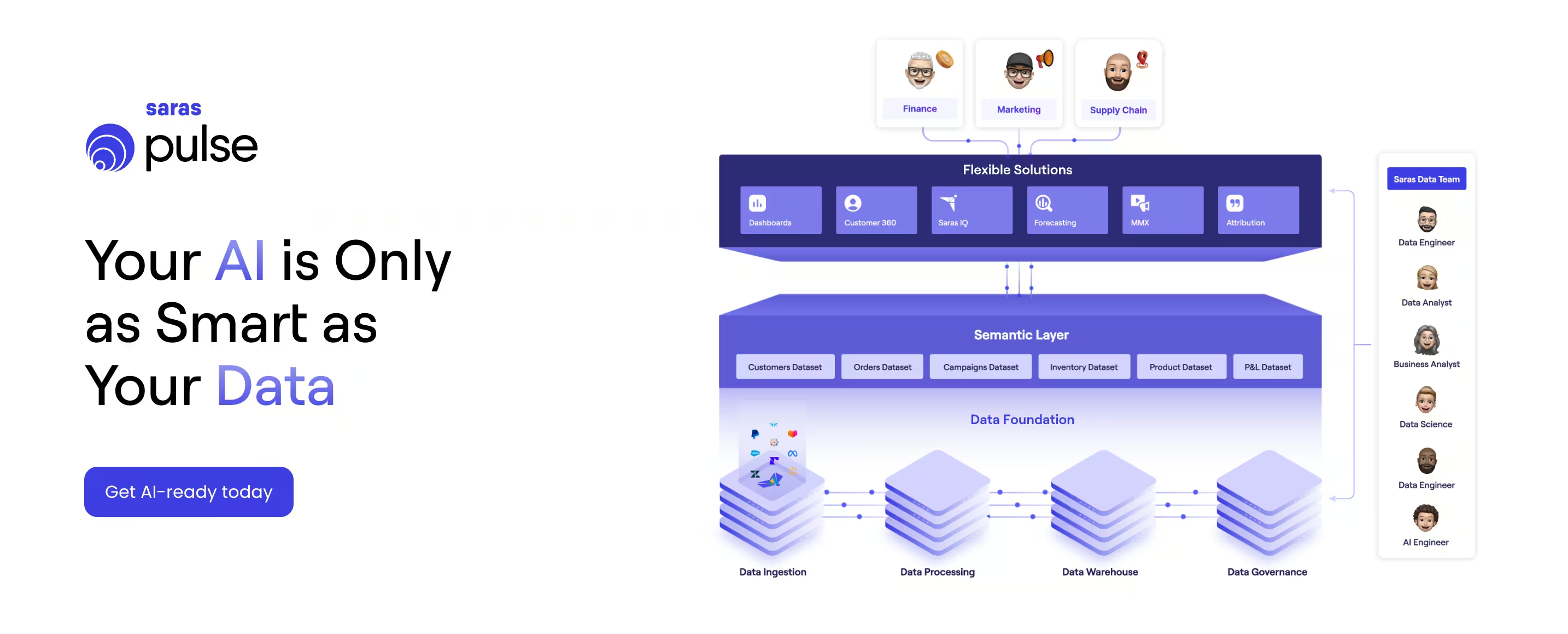
Saras Pulse is an analytics and BI platform built specifically for ecommerce and omnichannel retail teams. It focuses on delivering a unified, decision-ready view of data across customer analytics, marketing attribution, finance, and operations, with an emphasis on trusted metrics and cross-team alignment.
Key Features of Saras Pulse
Saras Pulse focuses on helping retail teams work from trusted data and make faster decisions across functions.
- Unified dashboards across teams: Shared views for marketing, finance, operations, and leadership, built on the same data definitions.
- Cohort and LTV analysis: Track retention, forecast lifetime value, and understand payback by customer group.
- Customer segmentation and Customer 360 views: Analyze customers using behavioral and purchase data across 200+ connected sources.
- Multi-touch, privacy-ready attribution: Measure marketing performance with flexible attribution models aligned to your strategy.
- Flexible data infrastructure support: Works with major data warehouses and supports custom business logic.
Pros And Cons of Saras Pulse
Every analytics platform comes with trade-offs. The table below summarizes where Saras Pulse performs well and where teams should plan accordingly.
Customer Testimonials of Saras Pulse
Feedback for Saras Pulse highlights its role in improving clarity, consistency, and decision-making across finance, marketing, and ecommerce teams.
A common theme across customer testimonials is the need for better visibility into margins, products, and retention, especially during periods of growth and operational complexity.
An SVP Finance from Momentous shared:
“We are growing quickly, and my focus is to ensure the business has the clarity and structure it needs to scale effectively. Saras Pulse helped strengthen our foundation and improve consistency and visibility of our product and margin data. This work supports the level of analytical rigor we need as we move into our next stage of growth.”
Head of Ecommerce and Retention at Momentous highlighted the impact on day-to-day decision-making:
“The ability to monitor the impact of various initiatives on retention in real time through cohort dashboards was a game changer for leading both our DTC and Amazon channels.”
Across testimonials, teams consistently cite trusted metrics, real-time cohort insights, and cross-channel visibility as reasons Saras Pulse has become central to how they manage growth, retention, and profitability.
Saras Pulse Is Best for
Saras Pulse is best suited for:
- Growing and mid-market ecommerce brands
- Omnichannel retailers selling across DTC, marketplaces, and retail
- Teams where marketing, finance, and operations need to rely on the same metrics
- Organizations moving beyond spreadsheets or generic BI tools into decision-ready analytics
Saras Pulse’s Pricing
Saras Pulse offers Growth and Enterprise plans, with pricing tied to annual revenue and data needs.
The Growth plan starts at $300 per month (or $250 per month on annual billing) and includes standard features, sources, a managed data warehouse, and support for up to 10 users.
Enterprise pricing is custom, designed for larger teams that need advanced sources, unlimited users, custom business logic, and dedicated support.
2. Databrain
DataBrain is an embedded analytics platform designed for software and SaaS companies that want to build analytics directly into their products. Its core focus is on customer-facing dashboards, self-service reporting, and analytics monetization rather than internal retail or ecommerce operations analytics.
Key Features of Databrain
DataBrain is built to help product and engineering teams deliver analytics as part of their application experience.
- Embedded dashboards and analytics: Build and embed interactive dashboards natively into applications using SDKs and web components.
- Customizable visualizations and white-labeling: Design pixel-level dashboard experiences that match product branding.
- Self-service reporting for end users: Allow customers to create reports, filters, and metrics within defined guardrails.
- AI-powered analytics features: Natural language querying, insight summaries, and conversational analytics for end users.
- Multi-tenant architecture and flexible deployment: Supports cloud, hybrid, and on-prem deployments with multi-tenant analytics models.
Pros And Cons of Databrain
Databrain Is Best for
- Delivering customer-facing analytics inside SaaS products
- Replacing embedded BI tools like Metabase, Superset, or Looker for product use cases
- Monetizing analytics as a product feature
- Reducing the engineering effort required to build and maintain embedded dashboards
Databrain’s Pricing
DataBrain follows a transparent subscription model with a 14-day free trial.
Plans start at $999 per month for Growth, $1,995 per month for Pro, with custom Enterprise pricing for advanced security, deployment, and support needs.
3. ThoughtSpot
ThoughtSpot is an agentic analytics and enterprise BI platform built for organizations that want AI-driven, self-service analytics across large, complex datasets. Its strength lies in natural language search, AI agents, and governed self-service BI rather than ecommerce- or finance-first analytics.
Key Features of ThoughtSpot
ThoughtSpot focuses on accelerating insight discovery across business users, analysts, and data teams.
- AI agents and conversational analytics for natural language data queries
- Live, interactive dashboards (Liveboards) with real-time data connections
- Automated insights, anomaly detection, and KPI monitoring
- Embedded analytics for internal apps and some customer-facing use cases
- Strong semantic modeling and governance for enterprise BI environments
Pros And Cons of ThoughtSpot
ThoughtSpot Is Best for
- Enterprise BI and self-service analytics at scale
- Organizations prioritizing AI-driven insight discovery
- Data teams supporting many business users across functions
- Companies modernizing traditional BI stacks like Tableau
ThoughtSpot’s Pricing
ThoughtSpot uses a user-based pricing model. Plans typically start around $50 per user per month (billed annually), with higher tiers and enterprise pricing available for advanced AI agents, embedded use cases, and large-scale deployments.
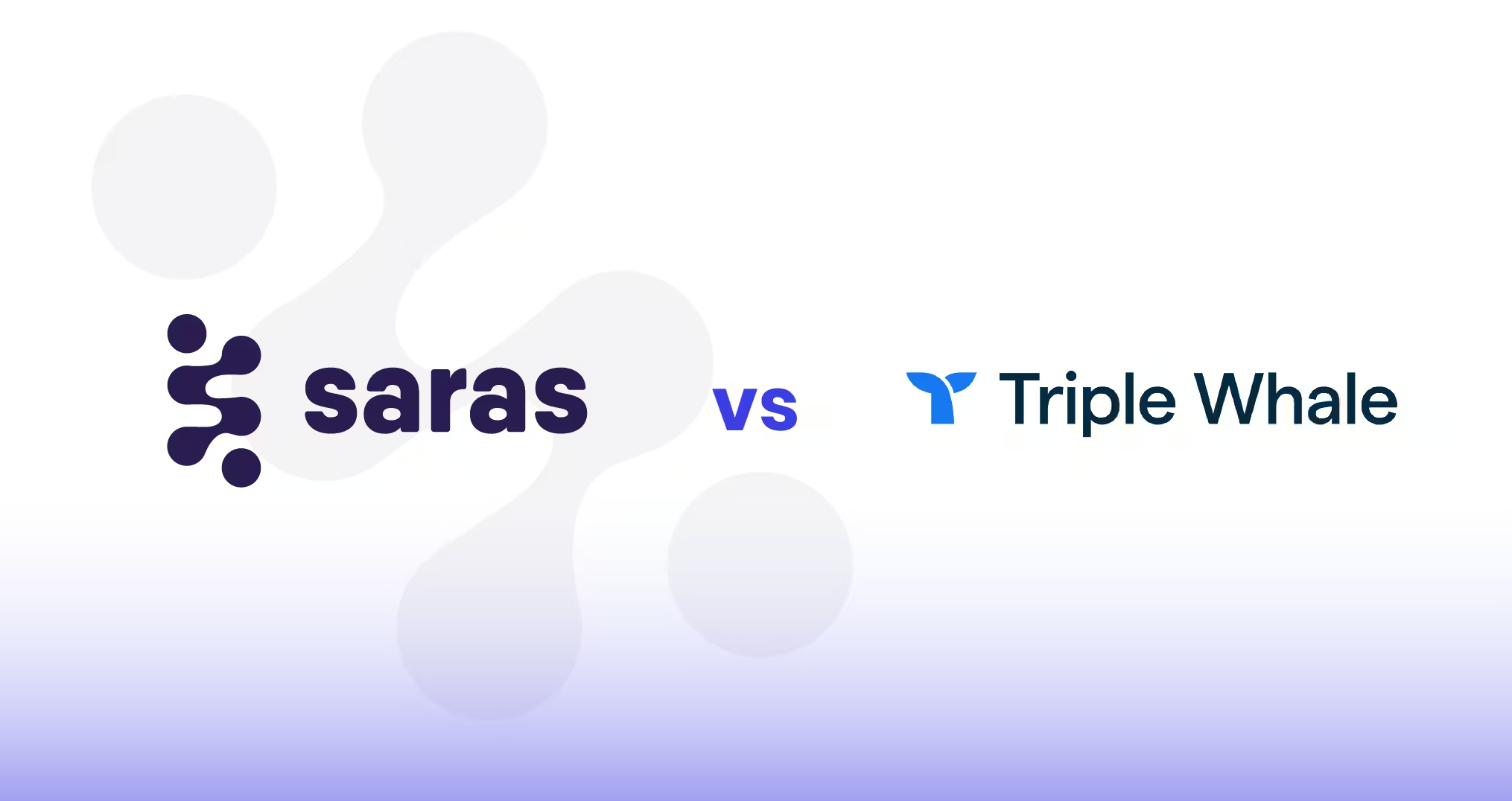
4. Triple Whale
Triple Whale is an AI-first ecommerce intelligence platform built around its “Moby” AI agents. It centralizes paid, owned, and revenue data into a single command center and uses AI-driven insights to guide decisions across acquisition, retention, conversion, and merchandising.
The platform is tightly focused on Shopify and DTC brands that want profit-oriented recommendations rather than traditional dashboards alone.
Key Features of Triple Whale
Triple Whale is designed to support fast, day-to-day decision-making for ecommerce growth teams.
- Moby AI and Moby Chat for natural-language queries, forecasting, and automated insight generation
- Pre-built Moby Agents for acquisition, retention, creative analysis, website conversion, and operations
- Triple Pixel with advanced identity resolution and multi-touch attribution
- Self-serve dashboards for channel performance, cohorts, product analytics, and post-purchase surveys
- Add-ons for Marketing Mix Modeling, GeoLift incrementality, and unified measurement
Pros and Cons of Triple Whale
Triple Whale Is Best for
Shopify-first and DTC brands that spend meaningfully on paid media and want an AI-assisted “decision engine” to guide marketing, retention, and onsite optimization without relying heavily on analysts.
Triple Whale’s Pricing
Triple Whale offers tiered pricing based on annual GMV.
- Free: Core channel performance, basic attribution, standard shop metrics, 12-month lookback, up to 10 users
- Starter: $149/month, adds multi-touch attribution, all marketing integrations, Sonar Send, advanced surveys, and unlimited users
- Advanced: $219/month, includes cohort analysis, creative and product analytics, custom dashboards, segmentation builder, SQL editor, and multi-store reporting
5. Polar Analytics
Polar Analytics is an all-in-one ecommerce data platform built for Shopify and omnichannel brands that want unified analytics, activation, and AI-driven decision support. It combines business intelligence, incrementality testing, data activations, and AI agents on top of a dedicated Snowflake data warehouse and a pre-built ecommerce semantic layer.
Key Features of Polar Analytics
Polar is designed to replace fragmented analytics stacks with a single, commerce-native data platform.
- Unified BI dashboards with pre-built ecommerce KPIs across CAC, LTV, ROAS, margins, and retention
- Dedicated Snowflake data warehouse with unlimited historical data
- Ecommerce semantic layer with hundreds of pre-defined metrics and dimensions
- Incrementality testing for Meta, Google, TikTok, TV, Amazon, and retail channels
Pros and Cons of Polar Analytics
Polar Analytics Is Best for
- Shopify and omnichannel ecommerce brands with growing data complexity
- Agencies managing multiple brands and needing standardized reporting
- Teams that want incrementality testing, not just attribution
Polar Analytics’s Pricing
Polar Analytics uses custom pricing, with all plans including:
- Dedicated Snowflake data warehouse
- Unlimited users and historical data
- Ecommerce semantic layer
Plans are typically structured around a Core Plan (BI + activations) or Custom Plans that add incrementality testing and AI agents. Pricing is provided via demo.
6. Putler
Putler is an ecommerce analytics software built for founders and small-to-midsize teams that want clean, trustworthy numbers in one place without managing spreadsheets, exports, or conflicting reports.
It aggregates data from tools like Shopify, WooCommerce, PayPal, Stripe, and Google Analytics, then cleans and standardizes it to present a single, reliable view of sales, customers, and products.
Key Features of Putler
Putler focuses on accuracy, usability, and speed to insight for everyday ecommerce decisions.
- Unified dashboard aggregating ecommerce platforms, payment gateways, and analytics tools
- Automatic data cleanup including duplicate customers, currency conversion, and timezone alignment
- 200+ ready-to-use ecommerce metrics and reports across sales, products, customers, and subscriptions
- Customer profiles with purchase history, location, behavior, and enrichment
Pros and Cons of Putler
Putler Is Best For
- Small and growing ecommerce businesses that want reliable numbers fast
- Founders tired of reconciling Shopify, PayPal, and Stripe reports
- Teams that need customer-level clarity without hiring analysts
Putler’s Pricing
Putler uses revenue-based pricing, making it accessible for early-stage and growing businesses.
Plans start at $20/month and scale based on monthly revenue, with tiers ranging up to enterprise-level usage.
A 14-day free trial is available with no credit card required.
7. Datawiz
Datawiz BI is a retail-focused business intelligence platform designed for multi-store chains and large retail operations. It centralizes sales, inventory, promotion, supplier, and customer data into one system, offering ready-made reports and AI-assisted insights to support assortment planning, pricing decisions, and promotion effectiveness.
Key Features of Datawiz BI
- Sales reports across stores, categories, and products
- Inventory management with excess stock and out-of-stock tracking
- Promotion analysis to measure real promo impact and margin effects
- Supplier performance reports for negotiation and assortment decisions
- KPI and performance tracking across stores and teams
Pros and Cons of Datawiz
Datawiz Is Best for
- Grocery, fashion, and specialty retail chains
- Businesses managing multiple physical stores and warehouses
- Category managers, merchandisers, and retail operations leaders
- Retailers focused on reducing lost sales and excess inventory
DataWiz’s Pricing
Datawiz BI follows a custom pricing model based on retailer size, data volume, and implementation scope. Pricing is provided on request, with a demo and trial available.
How to Choose the Right Retail Analytics Dashboard
Choosing a retail analytics dashboard is all about picking the one that fits how your retail business actually makes decisions, across sales, marketing, inventory, and finance.
Below is a practical way to evaluate options:
1. Start With Your Retail Model
Your operating model determines what “good analytics” means.
- DTC and Shopify-first brands usually need fast visibility into CAC, LTV, ROAS, and cohorts
- Omnichannel and store-led retailers prioritize inventory turns, promotions, and store performance
If a tool isn’t strong where your revenue is made, it will feel limiting.
2. Match the Tool to Your Team Structure
Analytics should reduce dependency without adding friction.
- Lean or founder-led teams benefit from tools that surface answers without analysts
- Larger teams need shared definitions, governed metrics, and role-based dashboards
Misalignment here is the most common reason dashboards go unused.
3. Evaluate Data Complexity, Not Just Dashboards
As soon as finance, subscriptions, or marketplaces enter the picture, simple reporting tools struggle.
- Multiple data sources require metric standardization
- Profitability and cohorts demand consistent definitions
Unified data matters more than chart variety.
4. Decide Whether You Need Reports or Decisions
Some tools are built for visibility. Others are built for action.
- Reporting tools show what happened
- Decision-focused platforms help answer what to do next
Be clear which one your team expects.
5. Ask These Before You Commit
- How are metrics defined and validated?
- Can marketing, finance, and ops rely on the same numbers?
- How long before insights are usable?
- What breaks when we add new channels or scale revenue?
Answering these questions prevents costly rework later.
Why Growing Ecommerce Brands Choose Saras for Retail Analytics Dashboards
Retail analytics dashboards have moved from basic reporting tools to core decision systems. As margins tighten and data sources grow, teams need more than isolated charts or delayed reports. They need a clear view of sales, customers, marketing efficiency, inventory, and profitability in one place.
The right dashboard helps teams answer practical questions faster. Which channels are actually profitable. Which products drive repeat purchases. Where inventory decisions affect cash flow. And how marketing performance connects to long-term value.
For growing ecommerce and omnichannel teams, the goal is reliable metrics that marketing, finance, and operations can trust and act on together.
If you want to see how this works in practice, book a demo of Saras Pulse to explore how unified dashboards, cohort analysis, and profitability views can support confident, day-to-day decision-making across your team.

.svg)
.png)
%201%20(1).svg)


.png)


.png)


.png)


.png)

.png)
.png)


.webp)
.avif)


.avif)

.avif)
.avif)
.avif)
.avif)
%20(1).avif)
.avif)
%20(1).avif)
%20(1).avif)